Final Digipack

Made For Love, Amora Rose

Click to view full digipak

Above is our completed digipak

Reflection:

The digipak is a representation of the star’s ideologies. We researched other artist’s digipaks to see the conventions of a pop digipak, eg, masthead, album name, images, track list, barcode, copyright script and a cohesive colour scheme. We went through a few versions of the digipak improving on colour correction, position of the track list, masthead fonts and images throughout. We were able to come to a finished product which uses all these conventions to signify (De Saussure) the metanarrative (Dyer) of our star and brand.

Draft 3 Digipak in Album Case

Digipak in Album Case with feedback from peers

Draft 3 Digipak:

Below is our digipak placed into an album case with a checklist of genres:

Reflection:

For this task my partner and I updated our digipak following the corrections given by our teacher, ready for it to be printed and placed in an album case where other students were able to analyse what genre they believe our digipak fits into to ensure we are following all the typical conventions of our genre pop. The peer feedback has allowed us to determine what went well and what connotes the themes and the genre well;

What went well:

  • Colour correcting the star and the colour’s red and pink to make them stand out, this has emphasised the cultural codes (Barthes) of love through the highlighting of the colour scheme used.
  • Adding the effects onto the masthead and album name to exemplify the themes of romance and attract the audience by using different but effective editing.
  • Adding the side panes of the digipak including the name of artist and album name so the digipak is identifiable.
  • Putting the track list on each side of the back pane to avoid covering the star’s image, focusing the audience’s attention evenly throughout the contents inside the digipak and the star’s interesting images.

What to improve:

  • The digipak’s right middle side’s image is slightly smaller than the left which makes the digipak uneven looking.
  • A transparent circle on the right-hand middle page needs to be added to add a cool effect where the cd will be placed.

Focus Forward:

This task has allowed me and my partner to assess our digipak for the final time and decide what is effective and what needs to be improved, using our peer’s feedback on what genre they believe our digipak fits in has enabled us to establish the conventional aspects.


Draft 2 Digipack and Teacher Feedback Screencastify

This is our Digipak Draft 2

Click to View

Reflection:

The digipak is a product which uses the star image to represent the target audience and attract them to listen to the artists music. My partner and I wanted to represent the psychographics and demographics of the target audience through the typical conventions seen in a digipak including, images, masthead, album name, track list and barcode. The images include appropriate mise-en-scene which highlights the star’s romantic persona, for example, the cultural code (Barthes) of the rose petals is a sign of traditional love and romance. Furthermore, the masthead and font used is bold, grabbing the audience’s eye and the name of the album written in traditional writing encoding (Hall)the writing used on old love notes exchanged via lovers. The track list involves many ideas on romance but also some statements which are powerful, emphasising her self confident nature, enabling the audience to build their personal identity(Blumler and Katz) off of the star image presented.

What went well:

  • The colour scheme red, pink, white and black running throughout connotes our themes of love and style by being semic codes (Barthes) of romance and elegance.
  • The proxemics of the star lying playfully over the roses, as well as blowing them towards the camera worked well on the front and left inside cover.
  • The editing of the roses onto the front cover adds a pop of colour to the front page and are done well.
  • The track list came out great, using inspiration from the internet for names which correlate to our genre and present those themes to the audience.

Teacher Feedback Screencastify:

Our teacher gave us some advice on what to do to ensure the digipak is the best it can be

What to improve:

  • To make the text stand out on the front cover add effects over the font, eg, drop shadows, 3D effects and outline the album name for it to pop on the page.
  • Position the track list on the back page away from the star to not block the image presented, eg, neatly in columns on the side which is typically seen in our genre pop.
  • Using the colour correction tools on photoshop, we can touch up some of the images to really make the red’s bright and small details like the necklace shinier and gold.

Focus Forward:

Overall, we have now created our own digipak using our own images and ideas, to complete this product we know what needs to be done and will be able to complete it knowing what conventions and media language is needed to attract our target audience and present the star image clearly.

Contact Sheet and Evaluation of the Digipak Shoot

Contact Sheet of Digipak Shoot Images

Click to view

Reflection:

Here is the contact sheet including all the photos taken from our digipak photoshoot. As shown through the images, we have decided on a specific colour scheme of red, pink and black, which are all symbolic codes (Barthes)of love and passion, ideas that we hope our target audience will decode (Hall) from our digipak. Furthermore, all images were taken in the black studio which help the petals colour and star’s features to pop brightly, alongside the black studio we also used the flash on all images to ensure clear, bold images. There are both great photos and not so great photos, but we collected enough to choose a great photo from which uses mis-en-scene and camera to represent our pop genre and themes of love.

Evaluation

What Went Well:

  • The props used uplifted the photos adding pop of colour and a deeper meaning to grab the audience’s attention and their desire to delve into those meanings deeper, they added the themes of love and romance just how it needed to be done.
  • The number of photos taken in this shoot is more then we have done in several other shoots to ensure that we had choice of which image fitted the psychographics and demographics of our star audience to gain maximum engagement.
  • Our abilities to pose for and take photos has improved from Year 12 meaning images had more meaning gained through camera angles and were clear and bold.

What to improve:

  • The costume was ideally supposed to be exactly how we presented it however looking at it after the shoot we should’ve added more colours including darker lipstick shown in our original PMA and colour throughout the dress.
  • Prior our next shoot for the social media page we need to organise ourselves further to ensure full efficiency of the photoshoot including specific images we will create instead of just simple inspiration, eg, long shots of the full body and tilted angles for something unique.
  • The rose petals added a lot to the images however, if we were to do this again we would need more petals to cover the whole studio floor to get the high angles of the star lying on them, as there was pieces of the floor being shown making taking effective images harder.

Below are my favourite photos from the shoot:

This will be used on the front cover of our digipak, the eye contact grabs the audience’s attention, and the pose reflects the star’s childlike, fun side. However, using photoshop more petals should be added to encode the star is blowing the petals at the camera (blowing her love through the photo to her target audience).

This is a nice image of the star with a relaxed facial expression, she looks poised and elegant which are psychographics of the star which the target audience will gravitate to. The rose petals in the background remind the audience of the themes of love and give the image some depth.

This will be beneficial for an inside cover image; it is a basic but effective image which uses media language to portray our themes and elevates the star image even in the absence of the star.

Focus Forward:

Overall, this task has allowed my partner and I to reflect on the digipak photoshoot, revisiting the reasoning for the way’s we shot the images and the mis-en-scene we included. We have images which clearly represent the themes and genre of pop and combined with editing will create an impactful digipak.

Digipack Draft 1

Draft 1 Digipak:

Using InDesign and some borrowed photos from the internet (due to not having done our shoot yet). My partner and I were able to create a rough draft/layout of how we want are completed digipak to look somewhat like. We have included, masthead (name of artist), name of album, positioning of these, positioning of track list, barcode and images similar to ours.

Assessment Criteria:

Print Production Skills:

  • Framing a shot
  • Using a variety of different shots
  • Ensuring that the mise en scene is clearly shown to the audience
  • Using conventions of layout and page design
  • Clear masthead and typeface

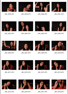
Below is the front page and back page draft 1 of the digipak

Front Page:

The masthead is in a bold font portraying the artist’s name, to grab the target audience’s attention and interest to take action and buy their favourite stars new product, however, the colour of the masthead could be changed to enhance the meaning of the media language presented, for example, red, a symbolic code (Barthes) of love which reflects the star’s characteristics of being a lover girl. The name of the album is also presented but the font and colour could be changed to something different then the masthead to create more engagement from the audience as it gives the digipak a more interesting look. The image reflects what we plan to do with the mis-en-scene in our digipak shoot which we are doing over the next couple of days, to avoid copyright issues. We will use inspiration from the images such as using media language such as camera angles, props, (roses a semic code of love) and costume (a black look to connote the star’s elegant psychographics) and colours which reflect the theme of love such as red and pink. Finally, the positioning of the text on the page is important to allow all aspects to be seen, particularly the image and masthead. This is a basic template including conventional elements of a pop genre digipak front page, but some changes need to be made.

Back Page:

The back page has included the main image, the positioning of the track list and the barcode and copyright information. The image will be changed when our own are taken but we will take inspiration from this, using a unique aspect of a silhouette, specifically of a couple to encode (Hall)the themes of romance and love. However, if this is not obtainable, we will use similar images to the front carrying on the colour scheme of red and pink and the prop of the rose petal, this will ensure total fluidity throughout the digipak. To add, the framing of our shots is especially important because it can offer another level of meaning for the audience to decode, (eg, high angle looking down shows inferiority) and good framing means a great view of the star which the target audience will want to see. To identify our digipak a barcode will be added and to avoid any copyright issues the information is presented on the bottom right-hand side. Finally, the track list will be evenly distributed down the sides of the back page to avoid restricting the view of the image but highlighting the products within the digipak. The back page will need a lot of editing and work to effectively reach the target audience and connote the star image.

What are we going to change:

  • Photos – we will change these photos to images of our own
  • Colour Scheme – we will change the colour scheme slightly to pink, red and black
  • Font – we will also change the font of the masthead and typeface

Focus Forward:

Overall, creating the draft 1 of our digipak has allowed us to create our ideas, turning them into real products for the first time, we can use this task to help us to improve our digipak whilst including all the typical conventions needed.

Risk Assessment

As we are shooting in the Black studio in our school, we do not need to complete a risk assessment sheet because there aren’t any serious dangers. However, we still need to remember to keep the studio clean, pack all of our things away, be careful with equipment or any props we use and notify our teacher before and after the shoot.

As we are in school under supervision, we do not need to message the model’s parents to allow her to take part as we are doing it in an independent study period where teachers are around if needed.

Production Meeting Agenda

PMA for the digipak photoshoot

For our digipack, we did our first photoshoot on school premises in the black studio. We completed a production meeting agenda (PMA), to make clear the mis-en-scene which will be used, camera angles (inspiration) and equipment needed for the shoot. This keeps my partner, and I organised when creating our next media product to ensure we include all conventions of the images used on a pop genre digipak and portray our star image through the different media language used.

Below is our PMA:

Click to View

Below is a slideshow of inspiration:

Mis-en-scene & Camera

Our star’s costume will be a stylish and girly black cupcake dress to portray her elegant side to the target audience whose psychographics relate to the glamourous style the star is presenting. Furthermore, makeup and hair also contribute to this style, the red allice band represents again her girly side, and the red lipstick is a symbolic code (Barthes) of classic femineity and confidence. The audience can construct their personal identities (Blumler and Katz) by including these aspects of the star’s image in their own styles. Finally, we are using different camera angles and props to enhance meaning and attention from the target audience, for example, the pink and red rose petals are semic codes of love as roses are the flowers which lover’s give to each other to express their feelings of love. The camera angles including extreme close ups, mid shots and medium close ups connote meaning to the audience by connecting them with the star through images, the different angles and also facial expressions used allow the star to create depth of meaning and not just surface level meaning. Overall, these are the mis-en-scene and camera angles (media language) we will be using to convey meaning and create connections and interests with the target audience.

Focus Forward

Overall, this task will help us with organisation and planning, allowing our shoot to run smoothly whilst including all the conventions of a front, inside and back page on a pop genre digipak. As well as giving us clear inspiration to create our goals.

Digipack Mockup

Our aims and hand drawn mock-up of the digipack

Hand drawn mock up

Reflection:

The digipack is an important element on an artist’s star image and in promoting a new product, therefore hand drawing and creating the basic ideas of our star’s digipack was important to us because we needed to be able to represent the idea of love but specifically our star’s idea of love with conventions we can only create an combine ourselves, making our digipack unique to any other artists.

For example, we have taken inspiration of using the red and pink roses as a symbolic code of love but have turned them into an image which we believe we attract the attention of our target audience specifically. The star ‘Amora Rose’ will be encoded as a classy, hopeless romantic which was discussed in our mission statement, this will be connoted through the mis-en-scene eg, lying on the bed of roses laid in a heart shape; to express the idea she is enraptured with the spirit of love and fully immerses herself into it. This is to emphasise the psychographics of our target audience being lovers and wanting to spread their love to others. We have not decided on a font for the masthead and album name but will use DaFont to do this when using online platforms to create the final digipack, but we do know we want it to be large to grab the audience’s attention, to make sure our media product is being bought. Our back page is going to include the star with a romantic partner to further enforce the concept of love with red/pink lighting creating a silhouette, we thought this was unique making our album stand apart from others in the music industry. Our track list will be included alongside other important conventions such as, the copyright script and barcode so our product is kept safe and can be identified. The track list will include all of the songs of the album, and the music video featured as the hit single.

Focus Forward

Our digipack will be created with all of the conventional media language in mind, plus our individual ideas of conventions for our theme, eg, roses, red, pink, heart. This will allow the target audience to take action and interact with the product, hopefully creating a large scale if engagement of the audience with the star. The digipack will act as part of the target audience’s reinforced personal identity, offering entertainment for the audience as well as the ability to connect to the stars through the images and songs. Overall, this task has allowed us to have creative freedom when producing our new media product which will be used to present the star image, other products and the genre.

LookBook

Padlet Lookbook- Inspiration for Digipack

Made with Padlet


Reflection

My partner and I created this Padlet to aid us through the creation of our next media product- the digipack, which we need to include conventions such as images, a masthead, a album name, copyright script and a track list. We needed to discuss and drop in many different ideas into the Padlet to find the best colour scheme, images, typeface and editing ideas which will encode the theme of love. For example, we looked at the colour scheme of pink and orange first but felt the orange didn’t signify the theme of love as much as the pink did so look for ideas which included red and pink which we felt was a better fit for the digipack. Furthermore, we looked at typography for the masthead, we wanted inspiration for this as this is one of the main pieces of media language included on a digipack, it should catch the target audience’s interest and attention through being one of the first things they will see on our media product. Next, the image was important for us as we needed to think carefully how we portray our star image in the digipack, so it matches with our mission statement, we want as any symbolic codes and representations of love throughout the digipack, so the target audience’s psychographics is reached, and they are satisfied with our product. Therefore, our star image will be photographed with roses and the colour red and pink as a symbolic code of love and as part of the mis-en-scene will be wearing a black dress which matches the mission statement of the idea that she is elegant. Finally, the back page image and track list should further entice the audiences desire to buy the media product through carrying on the themes presented in the mission statement eg, the star being a hopeless romantic, and act as a marketing strategy for each individual song and even major hit singles included in the album.

Focus Forward

Overall, this task has enabled us to gather inspiration for our digipack and choose the different media language conventional for it whilst keeping in mind the mission statement, themes of the album and the representation of our star image. The audience should understand our genre and themes of the album just by looking at the digipack, to ensure they buy our product we must think from the target’s audiences perspective and include the correct conventions to offer them entertainment, information on the star, opportunities to reinforce their personal identity around the star and create hyperreal relationships with the star by forming a social interaction so they feel connected to the album, songs and overall star image. Doing so, our media product will attract the target audience, through addressing specific psychographics, demographics and the conventional elements of a digipack, into the artists fandom and also offer opportunities for the star through increasing their audience.

Digipack Convention Analysis

Reflection

This digipack convention analysis includes all the conventional and unconventional media language included in Conan Gray’s album cover, this being the imagery, typography and technical conventions. These conventions are what my partner and I should include in our digipack as our genre is also pop just as Conan Gray’s is.

The imagery is the biggest part of this album cover presenting many symbolic codes of love and passion as well as the artist being included, using mis-en-scene such as emotional facial expressions and poses to attract the target audience. The artist has used these images and codes to enable the audience to create their personal identity based off of an artist’s media they are interested in and to help to form a social interaction between the artist and the audience to create what the audience may see as a ‘bond’.

Furthermore, the lack of typography shows that this was not an important convention to include in the album cover and may have been used as a marketing strategy to entice the target audience to take action and buy the album based off of the imagery and artists photos included on the front and back cover. 

Finally, technical conventions are included so the media product is protected when being sold, in the exchange of product for money.

Focus Forward

Overall, this task has enabled me to look at the conventions of a digipack/album cover in the genre of pop so when my partner and I come to creating our own digipack we will know what media language to use to attract the target audience.